Feature Friday: Getting the most out of your ON24 Target Hero Layout

Back in April, we introduced a new hero layout for creating targeted content landing pages— designed to empower our users to deliver the right content at the right time to specific audiences or accounts — to ON24 Target.
This new layout offers an eye-popping “hero image” that is above the fold and drives audience attention toward your featured content. But today, we wanted to let you in on a few tips that allow you to customize your page even more.
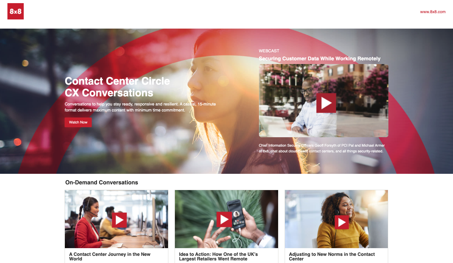
Featured Content: To Show or to Hide?
The hero layout can serve several purposes: grab readers’ attention and set the overall tone for the rest of the page, as well as work to complement one piece of content. This provides an opportunity to highlight a really great piece of creativity, such as a personalized video for your target audience or an upcoming webinar that you’re driving registration for.
But perhaps your big piece of hero content isn’t designed to promote a video, upcoming webinar, or point to that brand-new whitepaper. If your design (or budget) calls for a more minimalist approach, then you can simply hide the featured content thumbnail and let your image live on its own. Not all pages have the same goal or KPI, so we wanted to maximize your level of customization.
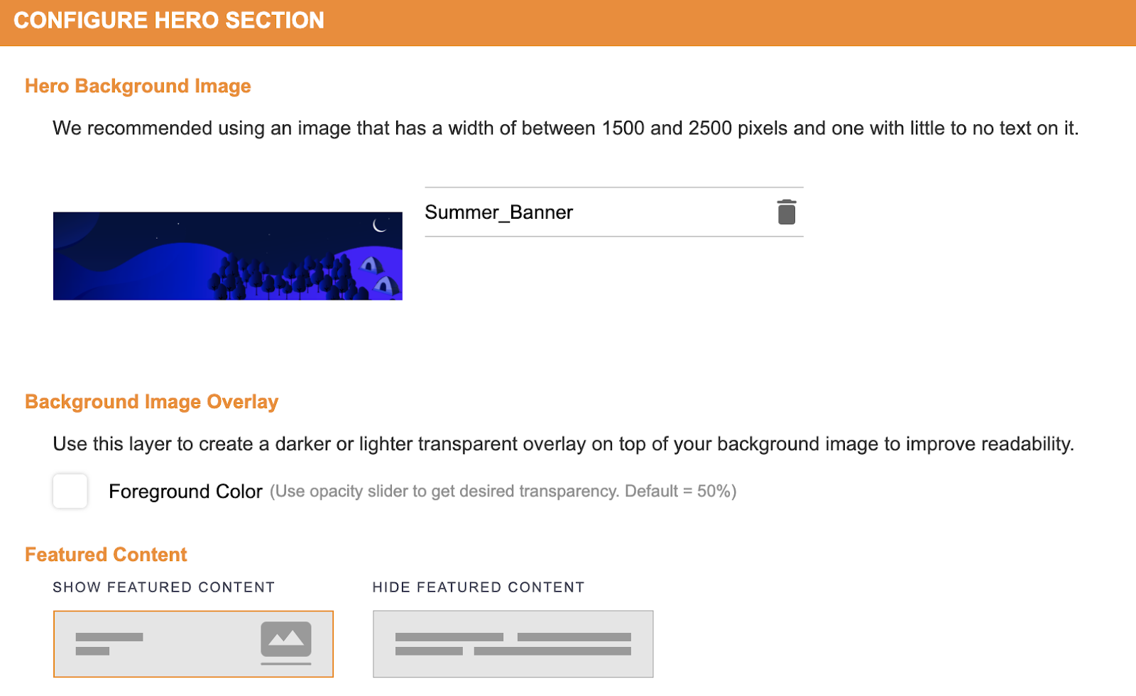
Once you’ve selected the hero layout and added your featured content, click the left-most Edit Hero Section icon and you’ll see the Featured Content section (as seen in the screenshot below). From here, you can choose to show or hide your featured content in the top panel.
What will this do exactly? Selecting Show Featured Content will display a thumbnail of your featured content on the right side of the hero section. Choosing to Hide Featured Content will keep the right side of the hero section blank with no thumbnail visible.
Check out this screenshot below from our Summer Webinar Stories series. The featured content — a webinar about Webinar Horror Stories — is visible with a custom thumbnail (S’mores!) that reinforces the theme and sets the creative direction for the rest of the Target page.
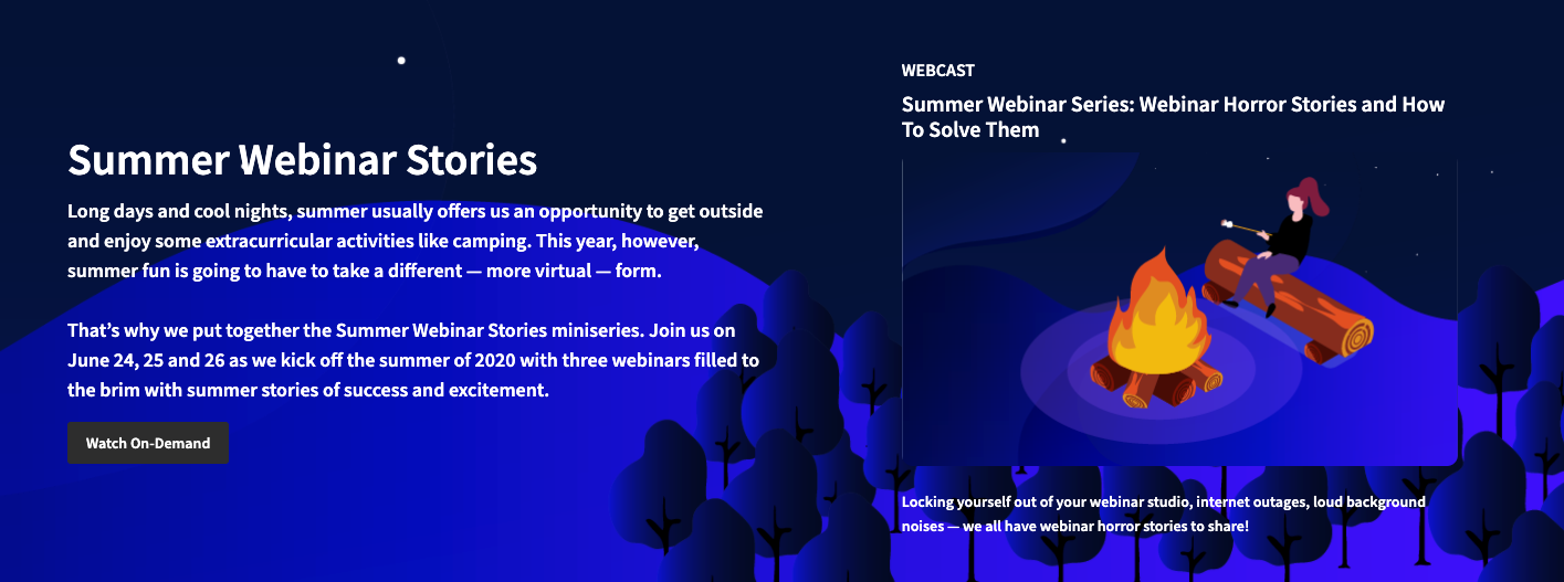
Hero layout with featured content thumbnail shown.
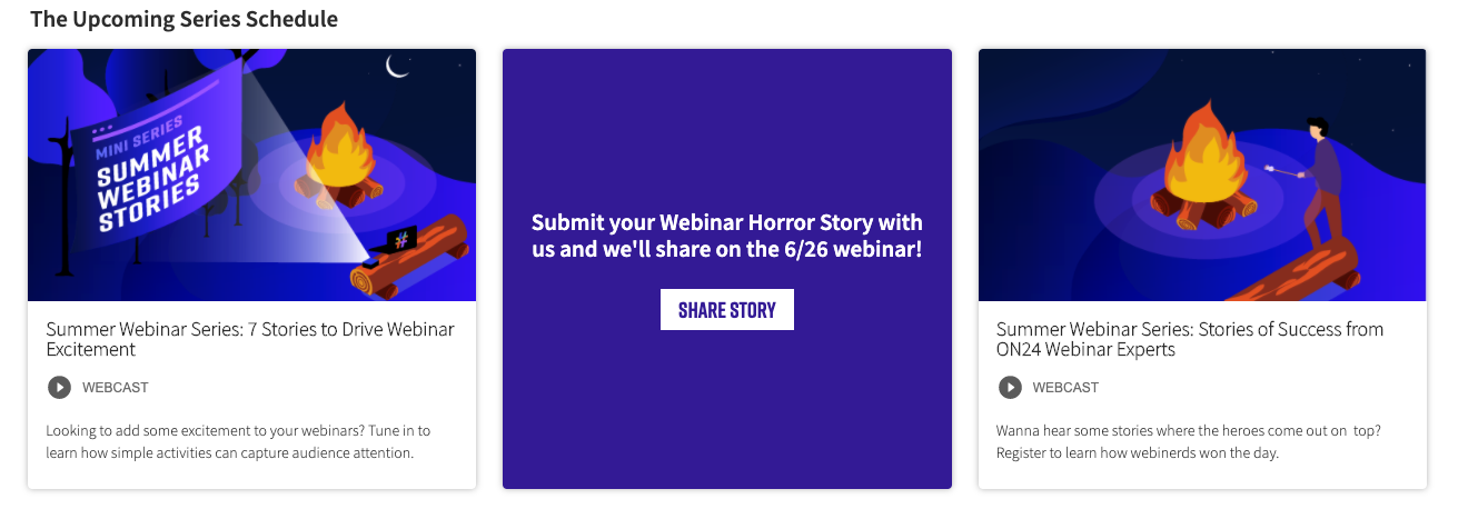
Additional content that reinforces the theme of the page.
This is just one use of ON24 Target, however. If you want to keep your hero content clutter-free, you can choose to hide the thumbnail of your featured content. The result might look a little something like this:
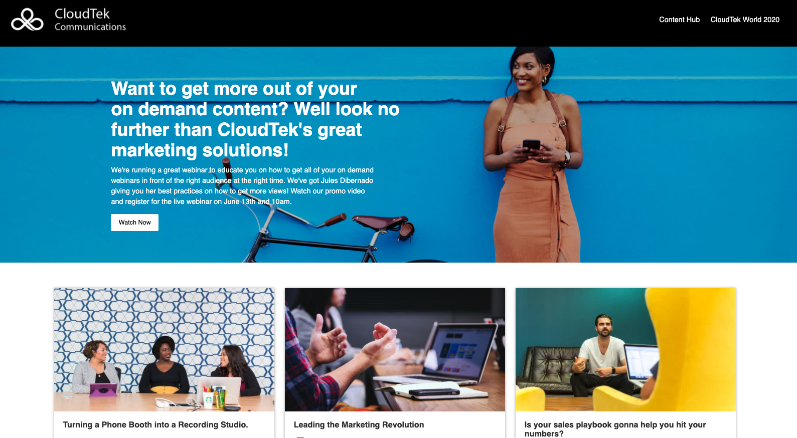
Hero layout with featured content thumbnail hidden.
You’ll notice no additional text or imagery on the right side of the hero. While this layout doesn’t have a unifying theme like our Summer Stories series, it’s still extremely clean and allows the creative to showcase a CTA and set the tone for the rest of the page.
As you can see, you have options when it comes to the hero layout in ON24 Target. We’ve shown you this one particular configurable option that allows you to tweak and customize depending on your audience or the assets at your disposal. Regardless of which design you choose, this is a great layout for grabbing attention with an eye-popping piece of creative.
Existing customers can reach out to their CSM for more information on customization in ON24 Target. If you’re interested in learning more, register for the on-demand webinar.