How to Set Up Content Hub for Always-On Brand Value

Branding your webinars is great, but the FUN doesn’t need to stop there. Now that you have a library of beautiful on-demand webinars, it’s time to brand your content hub! It can be overwhelming, so here are some tips on where to start.
Beautify Your Thumbnails

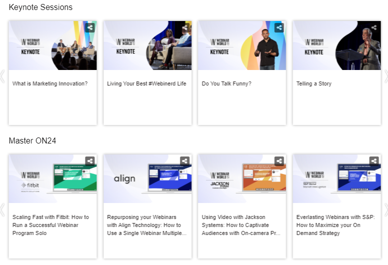
For the ON24 content hub capability, the most noticeable hub element is definitely going to be the thumbnail attached to each piece of content. So, it’s important to brand each thumbnail properly. You’ll want to avoid a strange hodgepodge of different styles. Work with your design team and develop one consistent style for content hub thumbnails. Then, use design for each piece of content.
Organize Your Content

You know what makes even the most carefully designed thumbnails look bad? Being dumped into a large unorganized hub. Ease of use not only offers a better user experience, but it also makes your content — and brand — look better. Break content out into categories or tracks to avoid clutter and make things easier to navigate. I am also very partial to using carousels, but you don’t have to.
Labels, Icons, and Other Accoutrements

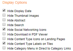
It’s easy to want to turn on every option under the sun. Avoid that impulse, it is going to look too busy. The goal is to make navigating your content easy, and icon overload can muddy the waters in that regard. Pictured above is the combination that we use most often in our content hubs. We find that this works very well.
And that’s it! Creating a content hub is a relatively straightforward process that will — hopefully — pay off in the long run and give your audience a great always-on brand experience.
Need inspiration for your next content hub? See how 10 companies make the most out of ON24 content hub with this free e-book. [Read Now]
