


Part of the fun of hosting a webinar is making it look good. Don’t settle for bland! Here are some quick tips on how to create great branded webinars.
Pick a Color Scheme
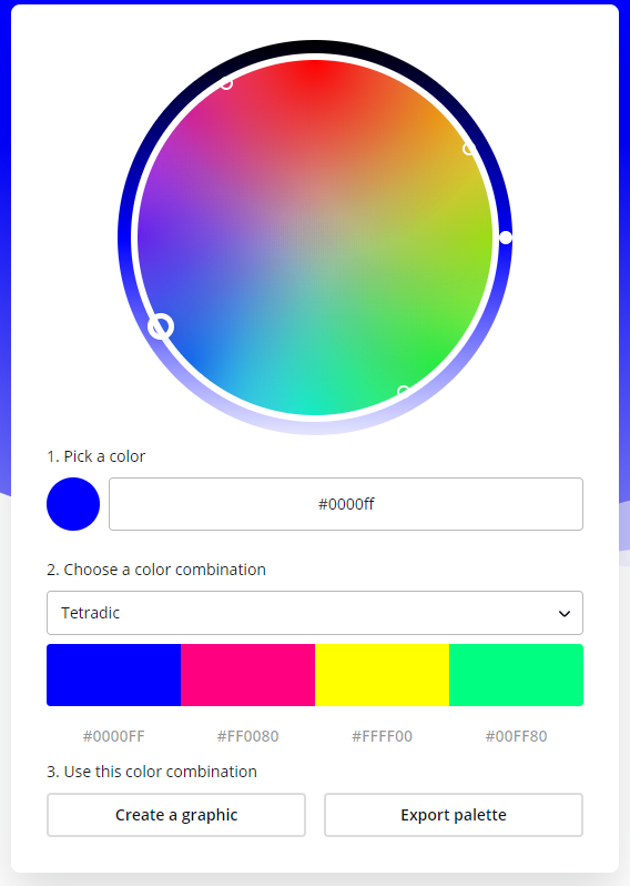
So, how to brand a webinar? The first thing you need to do is pick a color scheme for your webinar. This can be as simple as using your brand colors, or you can get a bit more complicated.
One great way to pick a color scheme is to start with a primary color, in this case, we will use blue (#0000ff). Navigate to a color wheel tool, I like to use canva. Enter your primary color, and when you select a scheme it will give you a group of colors that work well together. Go science!
Change the Icons

Webinars with stock icons are one of my pet peeves. Not only do they not look the best, but they are so easy to change that it shows a lack of effort – which is something incredibly off putting to customers.
You don’t even need to create icons for each webinar. I suggest creating a standard set of icons whose colors can be easily changed. This way you are always ready to brand a webinar, no matter the time or place.

Use a Background Image
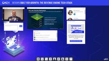
Please don’t just pick a background color and call it a day. A plain stock photo is not good either. Here is an example from one of our webinars, let’s look at some key factors.
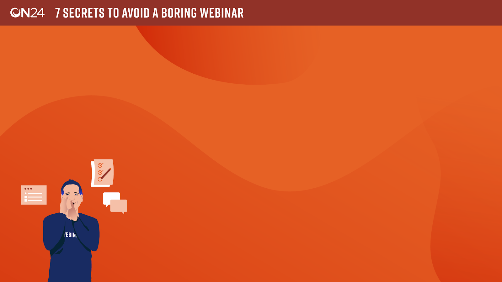
- Title – Including the title of your webinar in the background is a must. It is best placed in the top left for visibility.
- Pattern – You want to avoid flat colors. Using patterns with different shades is the easiest way to do this, and it looks cool!
- Size – Most people browse the internet on screens that are at least 1920×1080, so we use this size for all of our console backgrounds.
- Busyness – Try not to make the console background too busy. You don’t want to distract from your content, you want to compliment it.
GIFs? Not just for Memes
One of the coolest ways to really spice up your webinar branding is by using GIFs. GIFs can be used as the background, as well as in the CTA and Image widgets. The key here is to not go overboard. As mentioned above, you want to compliment the content, not distract from it – so keep it simple yet effective.
For some more ideas on creating awesome webinars check out these webinars that rock.