The Top Three Webinars That Rocked 2019
At ON24, we like to cap the end of the year on a high note. To do so, we go out and ask #webinerds like you to highlight the webinars you came across that you thought rocked. Then, we curate the best of the best and present them to you in our annual Webinars That Rocked event.
This year, we had a slew of excellent webinars to work through. And that’s not an exaggeration: from console design and programmatic approaches to planned interactivity and engagement — the crop of webinars this year was the best yet.
But who was the best? Let’s take a look at the three winners from this year’s Webinars That Rocked.
#3 Collette
Our first webinar that rocked is from Collette, a leading worldwide destination and travel company that got its start in 1918. So what did Collette do to make its webinars rock?
A Killer Console
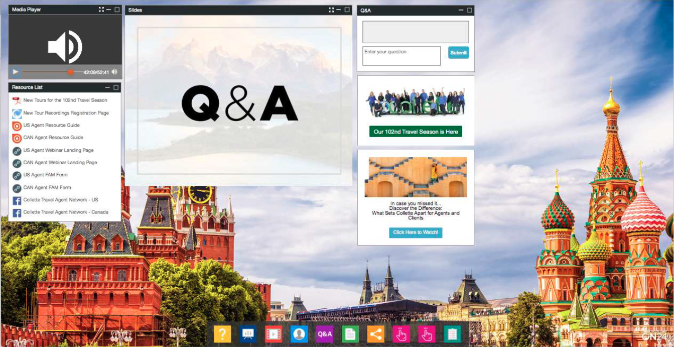
Looking to tour the world? Then you’re looking for places that make your interest pop. And what better way to capture curiosity than with plenty of resources and a console that makes Kodachrome jealous. Collette’s console uses a high-quality image of Red Square and St. Basil’s Cathedral to capture the viewer’s attention and includes an array of colorful icons for its toolbar at the bottom of the page. Great use of color.
Lots of Interactive Opportunities
Take another look at the slide above. How many engagement opportunities do you see? There are at least 15: 10 resources, two CTAs, a Q&A, a Survey and a Social Media tool. And there could be more! The point is: don’t be afraid to provide your audience with resources and opportunities for them to signal what they want from you. You can, as Collette did, let attendees sign up for an entire webinar series, direct them to a salesperson and much more. Get creative and refine as you go.
Seamless Multimedia Experience
When it comes to webinars, you don’t have to choose between audio, video or PowerPoint slides. You can use all three. Collette’s winning webinar, for example, is primarily an audio-based webinar where the presenters dial-in and speak to a pre-loaded slide deck. But instead of just leaving it at (admittedly stylish) slides, Collette also weaved in multiple video clips throughout its presentation. As Mark said, it’s a perfect way of making an audio webinar feel like a video webinar.
#2 Securly
Taking silver in this year’s Webinars That Rocked is Securly — an awesome company that helps communities to keep kids safe and engaged online, at school and at home. But how did it rock webinars exactly? Simple: smart branded design, approachable hosts, screen-share demos and tons of content.
Great Branded Design
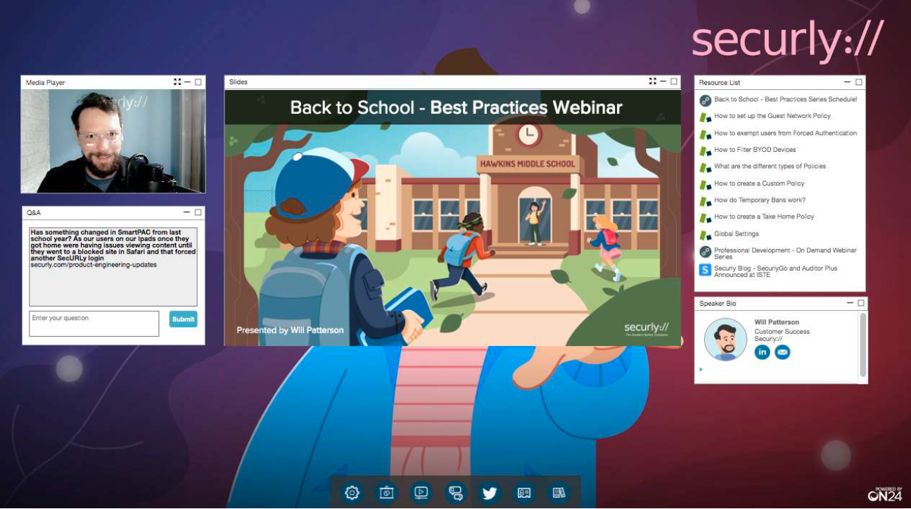
First, let’s talk about design. Securly themed its summer webinars around an immediate pop culture phenomenon that’s surprisingly in sync with what the company is about (minus supernatural ghouls and all that): Stranger Things. Getting inspiration from pop culture and TV shows is an excellent idea because it can be defusing and makes what you’re trying to share immediately relatable.

Serialized Webinars
But series branding is only one element at play. Hosts, too, can play an essential role in how a webinar series is received and how audiences relate to an organization. Securly’s approach is to bring Will Patterson, Security and Safety Evangelist (and competing Chief Webinerd) front and center to guide attendees through the webinar series, introduce subject matter experts and more.
Of course, you need to get audiences to sign up for your webinar series. To encourage sign-ups, Securly offers registrants the ability to sign up for more than one event in the series — letting them choose which courses to take over the summer. This is great on two levels. First, it gives registrants the control they deserve. Second, it highlights for you the topics that resonate with your audience.
Great Interactivity
Finally — and most critically — Securly knows how to generate interactivity. During its webinars, the company would facilitate an extended Q&A session that put audience questions up on the slide window — thrilling for the person who asked the questions and inspiring for those who’d like to get their questions up on the board. In addition to it’s great Q&A, Securly has a range of resources for attendees to download, link out to and read.
#1 Red Whale
Alright, the moment you’ve all been waiting for: the webinar that rocked 2019. And that prize goes to Red Whale — a leading provider of primary care medical care education in the United Kingdom. But what did it do to make its webinars rock? Let’s take a look:
Making a Difficult Topic Approachable
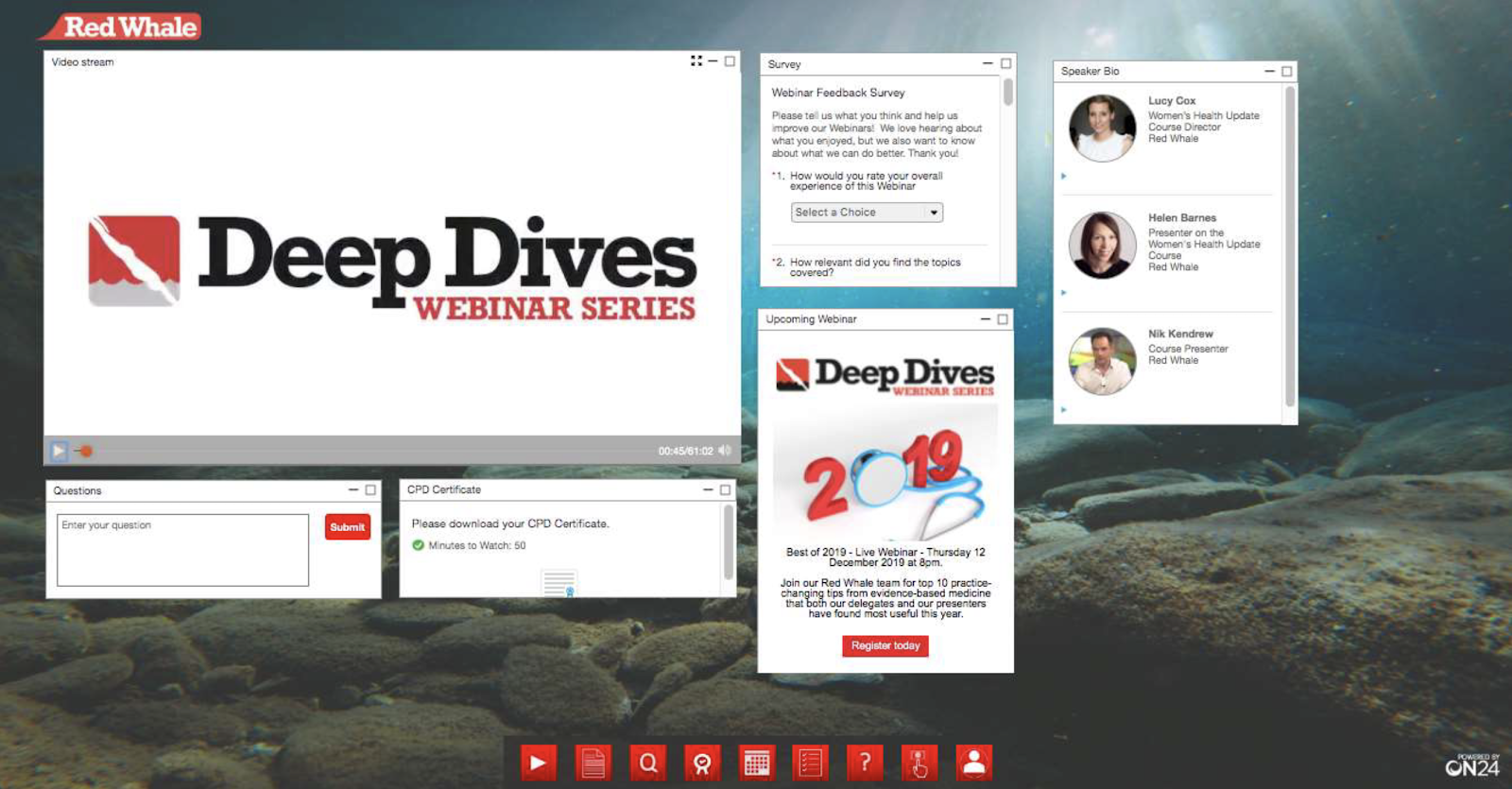
Red Whale had a tough job: take a fundamentally personal and sensitive issue, menopause, and make it both relatable and lighthearted to a mass audience that needs to know how to discuss menopause similarly with patients. How did it manage this task? Well, Red Whale provided its audience with a range of resources to download for their education, a Q&A chat, a CTA to for future webinars, polls and hosts that tied the whole thing together.
Multiple Presenters
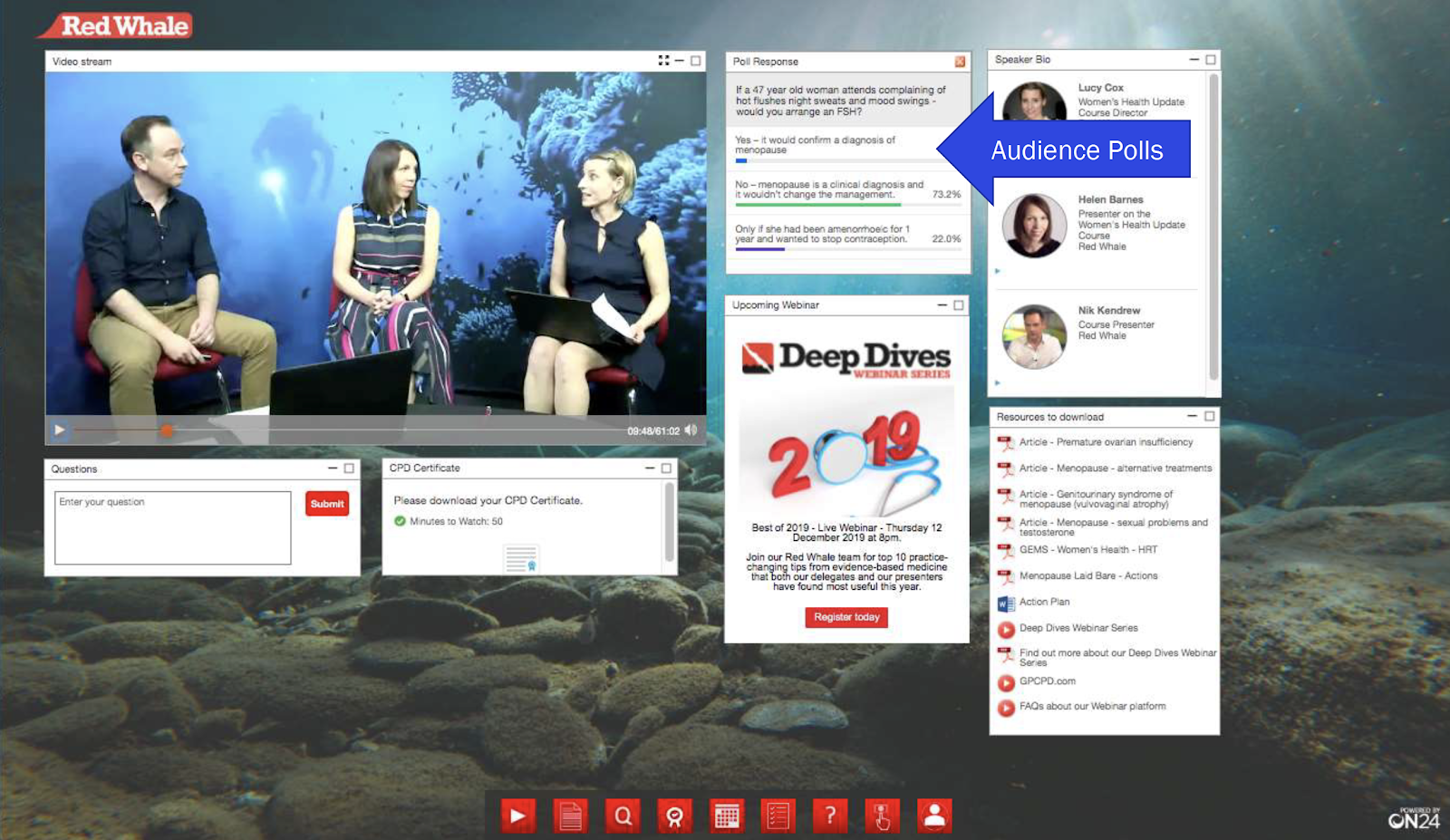
Red Whale’s multiple presenters played a critical part by diving into the details (also: note that “deep dive” is a recurring theme for the webinar background too — apt for a deep dive series) in their own way.
How? The hosts crafted their own skits that they then acted out in front of green screens to make their lessons more approachable. They even used baking as a metaphor to explain hormone replacement therapy. That’s incredible. And it brings us to our next point.
Making It All Seamless and Relatable
Red Whale had one focal point in its webinar: to make its subject as relatable and understandable as possible. It didn’t assume anything of its audience and it took the time to walk through its topic in memorable ways. But most of all, its hosts weaved the entire presentation together to create a fun, educational event that made it the most rockin’ webinar of the year.
So there you have it. Three webinars that went above and beyond in 2019 to deliver approachable content that resonated, educated and engaged with audiences of all backgrounds. If you’d like to learn more about how you can create a webinar that rocks, then keep an eye on this space in January — Webinerd Appreciation Month — when we take a closer look at all of the Webinars That Rocked 2019 finalists and why they each rocked in their way.
