Webinars That Rocked: Collette
In late 2019, we ran the annual Webinars That Rocked edition of Webinar Best Practices Series. During the episode, Mark Bornstein dived into what made rockin’ webinars so excellent. There were a lot of great entries, but Collette stood apart from the pack, taking bronze in last year’s Webinars That Rocked. Let’s take a look at why.
Collette, a leading worldwide destination and travel company that got its start in 1918. So what did Collette do to make its webinars rock?

Killer Consoles
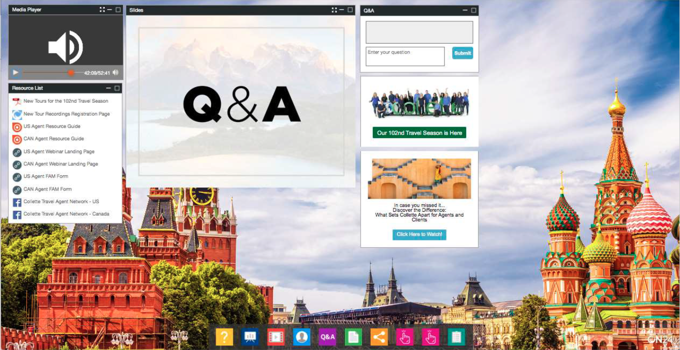
Looking to tour the world? Then you’re looking for places that make your interest pop. And what better way to capture curiosity than with plenty of resources and a console that makes Kodachrome jealous. Collette’s console uses a high-quality image of Red Square and St. Basil’s Cathedral to capture the viewer’s attention and includes an array of colorful icons for its toolbar at the bottom of the page. Great use of color.
Lots of Interactive Opportunities
Take another look at the slide above. How many engagement opportunities do you see? There are at least 15 — 10 resources, two CTAs, a Q&A, a Survey and a Social Media tool. And there could be more! The point is: don’t be afraid to provide your audiences with resources and opportunities for them to signal what they want from you. You can, as Collette did, let attendees sign up for an entire webinar series, direct them to a salesperson and much more. Get creative and refine as you go.
Seamless Multimedia Experience
When it comes to webinars, you don’t have to choose between audio, video or PowerPoint slides. You can use all three to great effect. Collette’s winning webinar, for example, is a primarily an audio-based webinar where the presenters dial-in and speak to a pre-loaded slide deck. But instead of just leaving it (admittedly stylish) slides, Collette also weaved in multiple video clips throughout its presentation. As Mark said, it’s a perfect way of making an audio webinar feel like a video webinar.
