How to Make A Webinar Look Professional [Infographic]

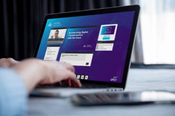
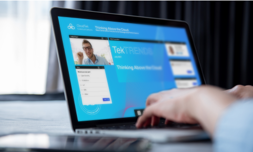
From guest panelists to slides and video production, a lot goes into setting up and producing a stellar webinar. But there is one element you should focus on when you want to make a webinar look professional: the webinar console design.
That’s right. Your webinar’s background, interactive tools and even the icons attendees see can have an impact on how your brand is perceived. After all, professional webinars must look the part too.
What to do? Don’t worry. We’ve broken down the essential elements of an amazing webinar console design in our infographic below.
What Background Should I Use For My Webinar?

Your webinar’s background is probably going to be one of the most visually engaging elements attendees see. The background you use should be relevant to the topic of your event, high resolution and dynamic.
High resolution means using any image with roughly 300 pixels per inch. High-resolution images are particularly important when you’re using something like a photograph for a webinar console background.
What Brand Elements Should I Consider When Creating A Webinar?

The typical attendee will be in your webinar for roughly an hour. That’s a lot of time where your brand is front and center. How can you make it stand out every second?
First, refer to your organization’s brand guidelines (if you have them). This tool will help you decide on what colors to use, typeface to employ and your company’s logo.
If you can’t find your brand guidelines, ask a member of your design team or see if they can’t produce the background and console for you.
On your own? Here are the essential design elements to consider when setting up your webinar console:
-
- Logo
- Color scheme
- Typeface
- Brand Imagery
- Speaker headshot
What Size Should My Webinar Background Image Be?

Webinar attendees have access to more devices than ever, which can make it difficult to produce a background that scales to accommodate laptops, desktops and everything in between.
Here’s the simple answer: your webinar console background should be 2900 x 1350 pixels.
A background image of that size will be large enough to accommodate both big and small monitors. However, and this is a big however, the console windows you use in your webinar should be set up for laptop users.
This means while your background should be 2900 x 1350, you need to set up your webinar console windows within a 1443 x767 pixel area.
Do Illustrations Make for Good Webinar Backgrounds?

Illustrations make for great webinar backgrounds. Like any console background, however, make sure the image is high resolution. An additional factor to consider? If you want to incorporate “invisible buttons” into your background.
Invisible buttons allow you to link a section of your webinar background to a URL of your choice. For example, you can embed a link to your next event directly into your background, making for a clear CTA.
To do this, upload your webinar background to ON24 Webcast Elite then create an image of the CTA you want to be displayed. Then simply upload an image, place it where you want it to be, select “configuration,” and add the URL you want to link to.
Which Windows and Tools Should I Include In My Webinar?

This entirely depends on the webinar you’re producing. Keep in mind the aim of most professional webinars is to inspire engagement with your content. That means you’ll often want to include a few basics like:
-
- Media Player
- Slides
- Speaker Bios
- Resources List
- CTA
- Q&A
How Can I Incorporate My Brand Colors Into My Webinar Console?

There are a few ways you can go about this, but the most impactful way to incorporate your brand colors is to change the colors of your menu bar icons.
To do this, simply click on the cog icon in Webcast Elite, select “attributes,” and upload your branded menu bar icons.
As you can see, there’s a few key aspects to take into account when planning professional webinars – especially in terms of webinar console design.
Remember, your webinar console design is just as important as the content itself, so make sure that you spend time also contemplating how to enhance your webinar console aesthetics.
Want to see professionals create amazing webinar experiences? Check out our infographic below or click here to download it!

