5 Key Takeaways from Webinars and Virtual Events that Rocked 2022

Every year we look at some of those most innovative events during our annual “Webinars and Virtual Events that Rocked,” and 2022 provided some great lessons and new ideas on how to deliver a truly engaging audience experience.
Here are a few key observations that might provide some inspiration in the new year.
Let your brand shine
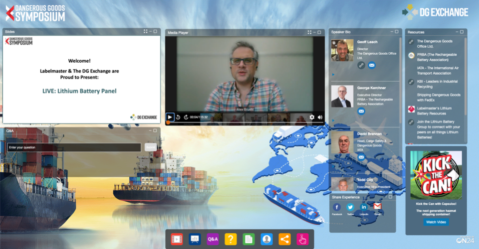
For many companies, your webinars and virtual events are the first time prospects come into contact with your brand. They say you never get a second chance to make a first impression, which means how your events look matters as much as what they say. This is especially true at a time when presenters are often presenting from home in… ahem, less than corporate environments.
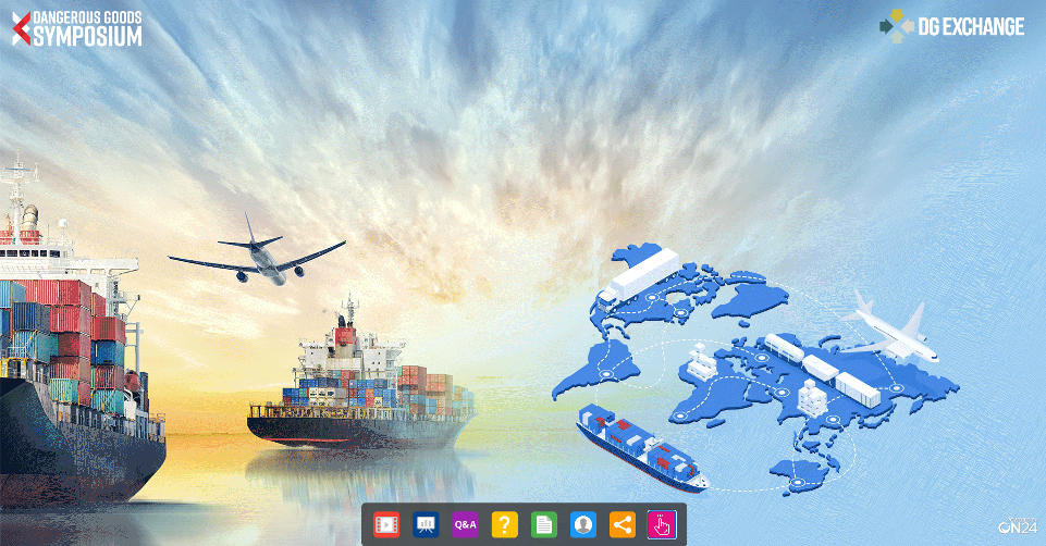
This year we saw tons of visually compelling experiences that showcased who companies were as a brand. Labelmaster, a company in the shipping industry created a webinar console that literally told the story of who they were, with images of ships and even a moving .GIF file of a plane flying across the console. So cool.
Sandvik, a manufacturing company in the drilling industry, delivered an amazing-looking webinar console with a high-res image of a drilling site that instantly communicated the essence of the brand and the event.
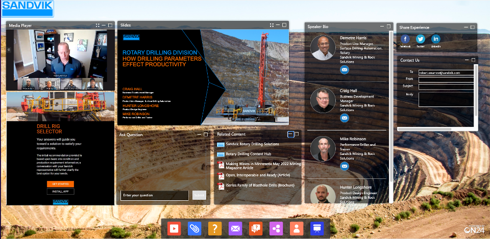
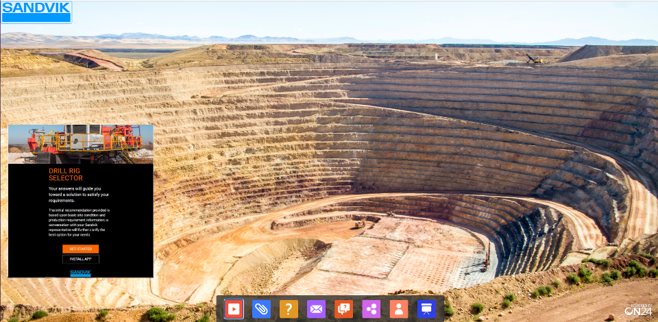
From a simple high-res photo, to creative graphic designs, in 2022 we saw many creative ways that companies communicated who they were, what they did and what they were talking about, by simply building a visually compelling experience.
Give your audience a tour
At a time when many companies are working hard to increase the engagement of their webinars and events, a realization has begun to sink in… it’s not enough to simply add interactive tools and content options, you need to let the audience know how they can engage.
We were impressed with this year were all of the creative ways that companies are letting their audiences know how to engage with an experience to get the most out of it, including:
-
- Video tours of the environment before an event even begins
- Hosts giving a verbal explanation of the console
- Hosts using slides as visuals to guide the audience in all ways that they can engage
- Boxes built into the console advertising everything the audience could do
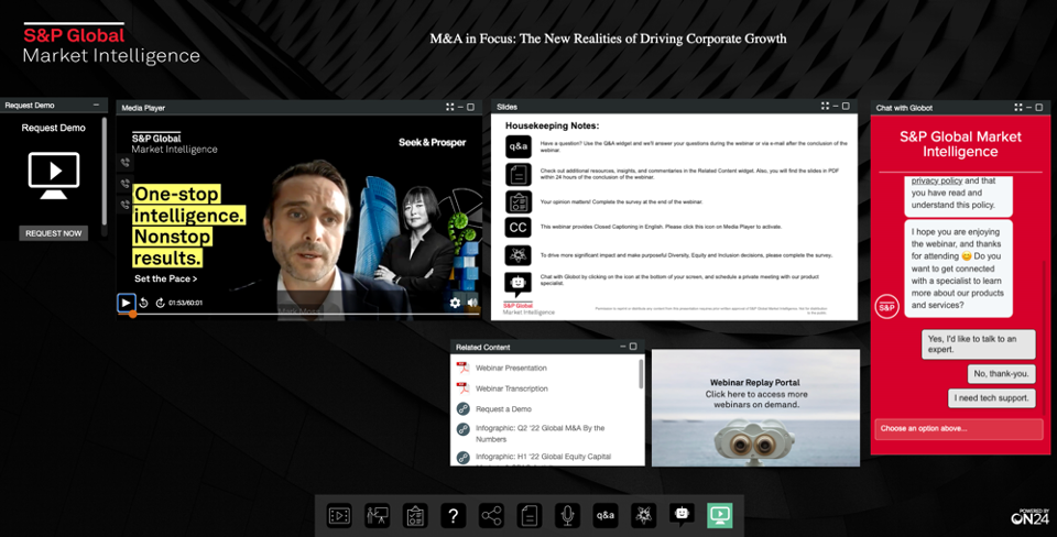
Here is an example of a webinar from S&P Global where the host highlights all of the engagement tools (shown in the slide) at the beginning of the presentation.
Let them binge!
There is no better time to drive people to your content than when they are already immersed in it. So many successful webinars this year provided links to on-demand content hubs that enabled people to binge on additional webinars, videos and other pieces of content relevant to that audience.
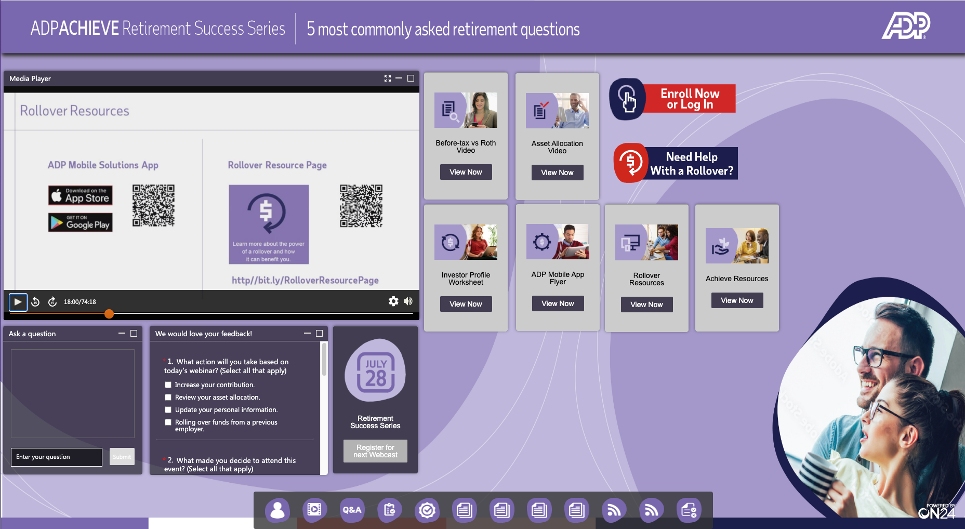
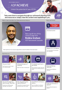
ADP creates amazing webinars which always contain links to additional resources. The company creates targeted content hubs customized for unique audiences.
We showcased one of their webinars where you can see lots of options in the console, including links to three different hubs, each one loaded with additional content audiences could self-select from.
Bigger audiences are still within reach
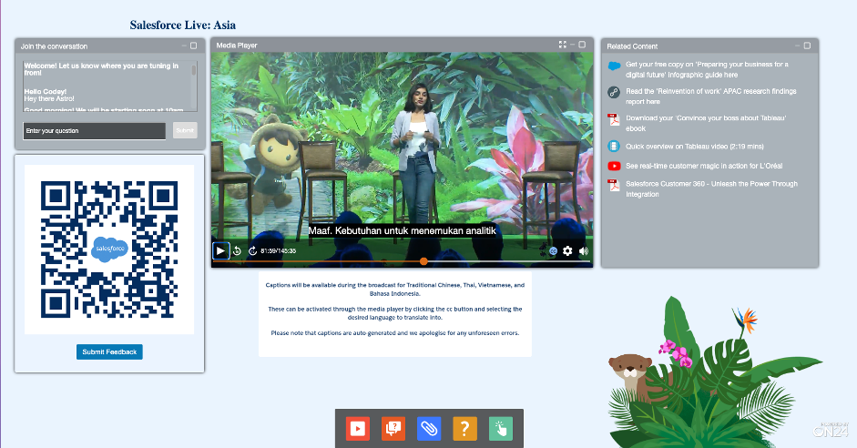
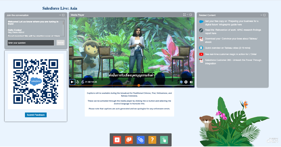
One of the newer emerging trends in 2022 was companies taking seriously the need to make webinars and virtual events accessible to all. We saw more events than ever including closed captioning options within their events to serve multiple geographies and languages. We are even starting to see sign language options in some events.
Turning on live captioning or adding it later for on-demand consumption is so easy to do, yet companies are only beginning to embrace this concept. If you want to scale your programs and expand the reach of your events, there is no better and more cost-effective way than to make them more accessible.
Here is an example of a Salesforce event from Asia, where there were multiple language options available. The audience could simply select their preferred language and closed captioning would appear.
A webinar can be anything
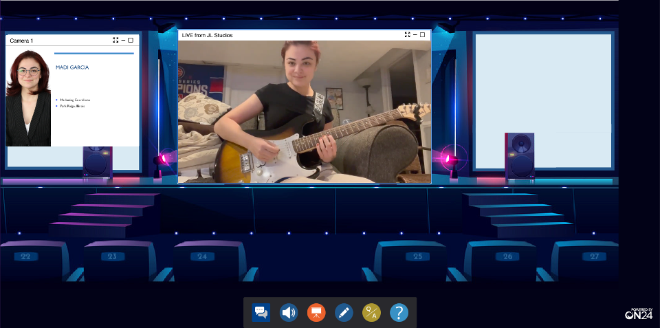
One of my favorite discoveries in 2022 was all the fun ways companies created unique experiences for their audiences. We saw community events and virtual happy hours, talent shows for employees, a cooking contest for interns, “best practices and pumpkin carving,” customer awards shows and more.
All further proving that a webinar is not a webinar; it’s anything you want it to be. Webinars and virtual events are simply channels for you to create great programming and experiences.
2022 was the year that brands figured out that the key to delivering a successful event was putting your audience at the center of the experience. From great branding to tons of interactivity, to more accessibility and on-demand journeys, to crazy and inspiring event types, it’s time to rethink the fundamentals of digital engagement.
If the innovation and creativity found in 2022 is any clue, 2023 could be an amazing year for our webinars and events.
