How to Make Your Webinars Look Amazing and Drive Results

You never get a second chance to make a great first impression. In today’s hyper-digital world, this rings more true than ever. Buyers today move fast and in a million different directions at the literal click of a button. The unique branding you present to your audiences has the potential to capture their immediate attention, keep them engaged and build the trust needed to convert them into customers.
Since webinars and virtual events are often the first time a prospect encounters your brand, they need to look and feel great. But great branding means more than the simple inclusion of corporate colors, logos or taglines. It is the bridge between you and your audiences, the catalyst into a two-way conversation between attendee and brand, the wow-factor that ensures your first impression is not just good, but unforgettable.
Read on for tips on how to design, optimize and scale your digital experiences to drive results.
Create visually compelling experiences

Audiences today expect every interaction with your brand to feel engaging, personalized and authentically human. They want the option to interact, participate and self-select their way through every digital touchpoint you deliver. Lucky for you, webinars and virtual events offer plenty of opportunities to provide your audiences with all of that. How?
A great place to start is by asking yourself this: how would you describe the experience of staring at your event console for an hour – the average length of a standard webinar? According to a recent poll run by ON24, 95% of marketers feel they could do a better job of creating visually compelling and totally engaging digital experiences.
With only 5% of marketers going the extra mile to visually engage their audiences, even a little bit of creativity will go a long way in helping you stand above the competition and reach your goals.
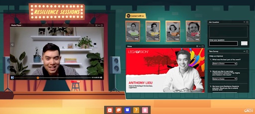
The easiest way to give your digital experiences a makeover is with high-resolution images and/or graphic design. Why build a monochromatic background in your corporate color(s) when you can bring the experience to life by encapsulating the world your audiences live in?
A great example is Mercury Healthcare’s “Reader’s Roundtable” webinar series. The team used a high-resolution image of a living room as their console background with the media player positioned on the wall like a mounted TV. Super creative.
But you don’t have to go big or go home. Slack proved that simplicity can be just as impactful by creating a totally immersive version of their brand. The point is that giving your console a little TLC can go a long way when it comes to getting (and keeping) the attention of your audiences while building brand affinity.
ON24 Tip: Build background images around the edges of your console to leave plenty of room for engagement tools and CTAs.
Optimizing for audience engagement

Visually compelling consoles should engage the mind as well as the eye. That means that every experience should include interactive elements that will keep attendees engaged. These can include links to digital resource centers, product demos, chat windows, live Q&As, invitations to upcoming events and other content offers. The trick is to eliminate dead ends so your audiences always have somewhere to go and something to do.
But what if they leave your webinar to access another resource? Good! Let them get to the content they need the most to help them in their journey.
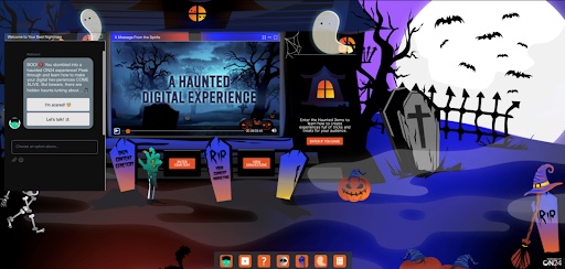
Modern engagement platforms enable you to get really creative in the way you build interactive experiences. ON24 delivered a virtual Halloween event that included tons of fun, clickable images that took audiences to demos, special offers or unique pieces of content to enhance the experience.
You can even incentivize attendees to engage by offering prizes for watching event sessions, downloading content or clicking on images to find answers to trivia questions and more. The idea is to encourage audiences to interact with the experience, making it more fun for them while you capture every interaction, which will help you get to know them better and ultimately, put them on a more personalized path to purchase.
ON24 Tip: A lot of marketers worry that filling up their consoles with too many creative and interactive elements will make the experience feel “busy” and overwhelm attendees. However, data shows that there has been a 25% increase in digital experience engagement.
Scale execution for repeatable results

Building webinars, virtual events and promotional assets (banners, emails, landing pages, etc.) takes a lot of time and resources. That’s why it’s important that you’re not starting from scratch every single time. Templates are your friend. Templatize every experience type and promotional asset you deliver so you can quickly duplicate and customize consoles with unique engagement tools when it’s time to launch the next event. Not only will this speed up execution, it will ensure brand consistency across every touchpoint you deliver.
Another tip? Create serialized programs that have their own unique look and feel. These programs can be easily templatized to help you deliver more targeted experiences at scale and help you build long-term audiences. Plus, it lightens your workload because all of the materials have already been built and will likely just need small customizations to reflect each episode.
You can do the same thing with digital content libraries by creating one master template and duplicating them to include personalized content for every target audience.
ON24 Tip: Make it easy for audiences to filter for the content they are looking for by categorizing the content in your digital libraries by topic and content type. Everybody wins.
Personalize every experience
By segmenting your audience into key cohorts, maybe by use case, role or industry, you can actually serve up a personalized digital experience, unique target audience.
Let’s say you are delivering a webinar to both prospects and customers. You wouldn’t want to include a “book a demo” CTA to existing customers nor would you offer an upsell opportunity to a prospect. By creating unique CTAs for different audience segments, you can more effectively get the right content to the right audiences at the right time, and help your sales team identify ready-to-buy leads and start warmer introductions.
Quality out, quality in

Going the extra mile to deliver fully-branded, visually compelling and engaging digital experiences will help you build brand affinity, drive more engagement, capture deeper insights and generate more quality leads. And pulling it off doesn’t have to be hard.
Creative branding, strategic interactivity and engagement opportunities, personalized CTAs and relevant content offers will set you apart from the competition and turn your webinars and virtual events into memorable experiences that leave a lasting impression on your audience and drive long-term growth for your business.

